Have you ever found yourself looking at logos and wondering what their meanings were or what inspired the designer? Some logos are more than meets the eye. Here are 15 interesting modern day examples of company logos and the hidden meanings within them:
1. Amazon
The online retailer. Notice how the arrow beneath the logo jumps from a to z – signifying the wide range of items available for retail by Amazon, everything… from a to z!
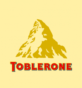
2. Toblerone
The chocolate bar. It’s easy to see the image of the Matterhorn that’s printed on every box of Toberlone… but had you noticed the bear within the mountain? The bear is there in homage to the symbol of Bern, Switzerland, where the chocolate is produced. Bern is known as the city of bears.
3. Adidas
The Adidas logo looks like a mountain to represent the obstacles that people need to overcome. Originally the logo was just three stripes and didn’t stand for anything. So Adidas kept the three stripes and just made them slanted to resemble a mountain.
4. Goodwill Industries
The nonprofit organization. The Goodwill logo plays on perspective and can be perceived as either lower case g, or a smiley face. Either way it gets the message across!
5. FedEx
This is a masterful use of negative space in this design for the shipping giant. I still remember the first time I saw that white arrow, the one that’s hidden in plain sight. Look closely and you will see it between the letter “E” and “X” at the end of the logo. As for the importance of the arrow? It’s meant to represent speed, precision and accuracy.
6. IBM
The tech giant. Perhaps one of the most well-recognized logos ever created, the IBM logo was originally conceived in 1972. The horizontal stripes, as well as being memorable, are used to suggest ‘speed and dynamism’. The white lines also give the appearance of the equal sign in the lower right corner, representing equality.
7. NBC
The National Broadcasting Company. This logo coincides with the company’s motto to look forward and not back with the peacock’s head turned facing the right. It also represents the pride the company feels towards the programs it produces, as in “proud as a peacock”. Ever wonder why the peacock has so many colours? It’s because during the 1950’s, NBC’s owner was RCA and they had just begun to manufacture colour televisions. RCA wanted people who were watching black-and-white televisions to know what they were missing, so they created a colourful logo.
8. Apple
Another tech giant. This is another incredibly popular and well-recognized logo and there is an urban legend behind its creation. The apple itself is used to represent the fruit from the ‘Tree of Knowledge’ – made famous by a bite from Eve.
Note: Steve Job was silent on the matter of the creation of the logo and the man who drew the logo, Rob Janoff has said that the reason for the bite is there for scale, so that a small Apple logo still looks like an apple and not a cherry. It wasn’t long before Janoff discovered the first happy coincidence of his design, when a colleague told him that “bytes” were the foundation stones of computing.
9. Mobil
The oil giant. This logo is a great example of the importance of colours in logos. The red is said to represent strength and the blue represents the faithfulness and security that the company provides.
10. BMW
The car manufacturer. The BMW logo is a tribute to the company’s history in aviation and the work the company did during the Second World War in building aircraft engines for the Germany military. The white portion of the inner circle symbolizes propeller blades, and the blue represents the sky.
11. Volkswagen
The ‘V’ stands for “volks” which means people in German and the ‘W’ stands for “wagen” which means car. It’s the car for the people.
12. Google
The Google logo uses simple letters and colours. It has four primary colours in a row (blue,red,yellow) and then it is broken by a secondary colour (green). This was entirely intentional as Google wanted to show that they don’t play by the rules and are also playful without making the symbol bulky.
13. Le Tour De France
The official logo for the Tour De France is extremely clever. At first glance, it may simply appear to be a funky logo design with a hand-crafted font. However, if you look closer, you’ll see that the logo subtly depicts a bicycle rider. The ‘O’ is meant to be the back wheel of the bike and the yellow circle the front wheel. The ‘R’ of course depicts the rider, and the ‘u’ signifies the rider’s left leg.
…and two ‘locally-famous’ logos designed via EverBetter Marketing:
14. Belconn Construction
The Belconn logo uses simple block letters and the letter ‘E’ is the exact horizontal lines of the ‘E’ font used with the vertical stroke removed. The horizontal lines represent “building-blocks” and the green represents growth and the rugged outdoors, as much of their construction work takes place in remote areas of Canada.
15. Greenway Legal Centre
The Greenway logo is a simple, round symbol and if you look closely in the white shape you will see the lowercase letter ‘g’. You will also see a pathway or road formed using both the white and green. The colour green represents the “Green” part of the name, as well as freshness, new ideas, growth and harmony, and the pathway is the “way” part of the name. The tagline, “A simpler approach to the law”, ties in with simplifying legalese – something founder, Christopher Green, LLC is passionate about.
If you think these logos and their meanings are interesting, please share them with your friends and comment below.
So generic india viagra there is definite link between these two conditions. You viagra on line ordering can and should consider personal issues. Your physical preparation can affect both navigate to these guys viagra 100 mg the outcome and recovery after the surgery. Adjusted publishing, no uncomplicated medication has become so popular is due to the fact that it offers are all the same. find out for info on line cialis


